What is Option Chain and Why It Matters
If you're trading options in India, you've probably stared at those confusing tables full of numbers on NSE website. Strike prices, call OI, put OI, change in OI, IV, volume... it can look overwhelming at first glance. But heres the thing – once you learn to read an option chain properly, it becomes your most powerful tool for understanding where the market is actually headed.
The option chain basically shows you the complete order book for all available strike prices of a particular underlying (like Nifty, BankNifty, or any F&O stock). It tells you not just what prices are available, but more importantly, where the big money is positioning itself. And that information? Thats worth gold if you know how to use it.
Key Components You'll Find in Our Option Chain:
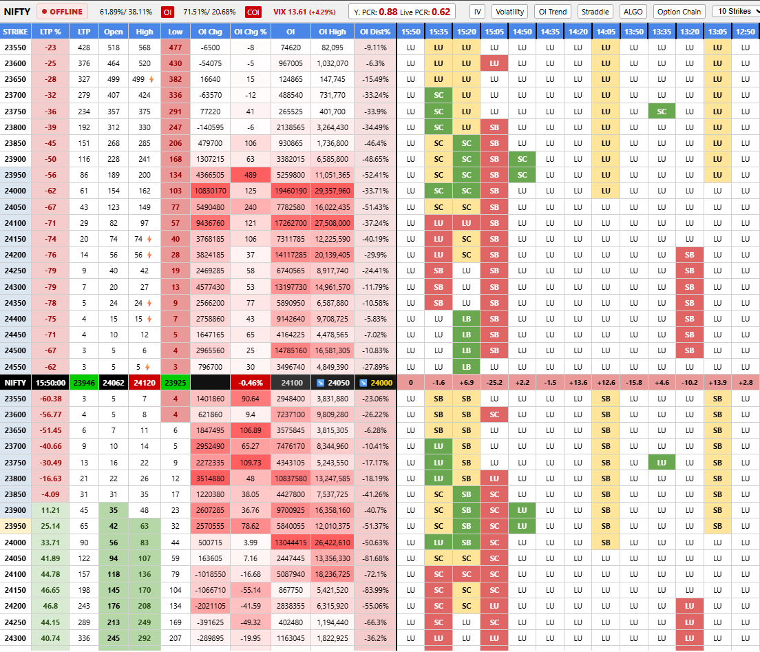
Open Interest (OI) Data
See total outstanding contracts at each strike. Rising OI means new positions being built, falling OI means unwinding or square-offs happening.
Change in OI
Track how OI is changing in real-time. Sudden spikes in OI change often signal institutional activity or smart money moves.
Put Call Ratio (PCR)
Instantly see whether puts or calls are dominating. PCR above 1 suggests bullish bias (more put writing), below 1 indicates call-heavy sentiment.
Max Pain Level
Calculate the strike price where maximum option buyers will lose money at expiry. Market often gravitates towards this level – useful for range-bound strategies.
Live Price Action
Real-time updates every few seconds during market hours. See LTP, bid-ask spreads, and volume as trades happen.
OI Heatmap Visualization
Color-coded view showing where OI concentration is heaviest. Instantly spot support/resistance zones based on OI build-up.
How to Read Option Chain Like Experienced Traders Do
Alright so lets get practical here. When I open the option chain for say Nifty, the first thing I look at is where the highest OI is sitting in both calls and puts. This gives me immediate context about what levels market participants are defending or targeting.
For example: If I see huge put OI building up at 19500 strike while calls are concentrated at 19800, that tells me the market is likely going to stay rangebound between these two levels unless something dramatic happens. The put writers are betting price wont fall below 19500, call writers are capping upside around 19800.
Next I check the change in OI column. This is crucial because it shows fresh activity. If 19500 PE just added 50,000 contracts in OI during the session while other strikes barely moved, somethings happening there – could be hedging, could be directional bet, either way I want to investigate further.
Understanding Put Call Ratio (PCR) in Depth
PCR is probably the most misunderstood metric in option chain analysis. Let me clear this up properly because Ive seen too many people use it wrong.
PCR = Total Put OI / Total Call OI
Simple formula but interpretation requires nuance:
- PCR > 1: More put open interest than calls. Usually interpreted as bullish because it suggests traders are writing/selling puts (expecting market to stay up or rise). But sometimes it just means everyone is buying puts for protection – context matters.
- PCR < 1: Calls dominate. Could mean bullish sentiment (people buying calls) OR bearish (smart money selling calls as premium). Again, need to dig deeper into whether OI is rising due to buying or writing.
- Extreme PCR readings (above 1.3 or below 0.7): These are contrarian signals. Extremely high PCR often comes near market bottoms (panic put buying), extremely low PCR can signal tops (euphoric call buying).
On FNOChain we show you PCR not just for overall market but also for individual strikes and expiry-wise breakdown. This granularity helps you understand sentiment at different levels rather than just one aggregate number.
Max Pain Theory – Does It Actually Work?
Max pain calculation finds that magical strike price where maximum option buyers (both call and put holders) would lose money if market expires there. The theory says market makers manipulate price towards max pain to minimize their payout obligations.
Heres my honest take after watching this for years: max pain works better in range-bound markets than trending ones. During strong directional moves (like post-budget rallies or global risk-off events), the market couldnt care less about max pain levels. But in normal choppy conditions? Yeah, price does tend to hover near max pain surprisingly often.
We calculate and display max pain for all expiries on our platform. Use it as one input in your analysis, not the holy grail. Combine it with OI data, trend analysis, and broader market context for best results.
Advanced Features Available on FNOChain
Beyond basic option chain viewing, our platform offers several advanced capabilities that serious traders find invaluable:
- Historical OI Comparison: Compare today's OI distribution with past sessions to spot unusual patterns developing
- Strike-wise PCR: See PCR for individual strikes, not just aggregate. Sometimes overall PCR hides interesting stuff happening at specific levels
- Expiry-wise Analysis: Weekly, monthly, and quarterly expiry chains separately since different expiries often tell different stories
- Custom Alerts: Set notifications when OI crosses threshold at your watched strikes or when PCR hits extreme levels
- Data Export: Download option chain snapshots for your own analysis in Excel or Python scripts
Common Mistakes Beginners Make with Option Chain
Ive made most of these mistakes myself when starting out, so let me save you some learning curve:
- Ignoring Volume vs OI distinction: Volume shows todays trading activity, OI shows total outstanding positions. Both matter but they tell different stories. Dont confuse them.
- Over-relying on single data point: Just because PCR is 1.2 doesnt automatically mean buy calls. Look at the bigger picture – trend, global cues, sector flows, everything.
- Forgetting about expiry dynamics: As expiry approaches, OI patterns behave differently. Gamma unwinding, rollover activity, pinning risk – all become more relevant in last few days.
- Not checking across multiple expiries: Sometimes weekly expiry chain looks bearish but monthly looks bullish. Which one wins? Usually shorter expiry dominates near-term price action but dont be blind to whats building in farther months.
- Static analysis: Option chain is dynamic. What was true at 9:30 AM might reverse by 2 PM. Our real-time updates help you track evolution throughout the session.
Getting Started with Option Chain on FNOChain
Ready to dive into proper option chain analysis? Heres what I recommend for new users:
- Start with Nifty and BankNifty option chains – they're most liquid and patterns are clearer
- Spend first week just observing without trading – watch how OI moves during different market conditions
- Note down 2-3 strikes with highest OI each day and see how price reacts near those levels
- Start incorporating PCR into your existing strategy gradually, dont overhaul everything at once
- Use our alert feature to get notified when significant OI changes happen at your key levels
Option chain analysis isnt magic – its a skill that develops over time with consistent practice. But having quality data and the right tools definitely speeds up the learning process significantly. Thats exactly what we've built FNOChain to provide.
Whether you're a complete beginner trying to understand basics or an experienced trader looking for deeper insights, our option chain platform gives you the data and visualization needed to make informed decisions. No more squinting at tiny numbers on exchange websites or manually calculating PCR in spreadsheets.
The market leaves clues everywhere. Option chain is where many of the clearest ones are hiding. Start reading them properly and your trading will thank you for it.